
Do you need help?
Do you need help?
Graphic Design
Branding
Website Design
Social Media
Communication
IURIDIA is a research project funded by the Conselleria of Education, Universities, and Employment, for excellence research groups, entitled “The new era of algorithms and Artificial Intelligence and its private law protection within the European Union”.
The project’s mission is centered on analyzing the private law measures already implemented by the European Union to build a community-level legal framework for Artificial Intelligence (AI). This analysis must be interconnected with the civil liability regime, which includes current regulations on consumer and user protection against damages they may suffer due to the use of defective products when AI-powered robots are involved.
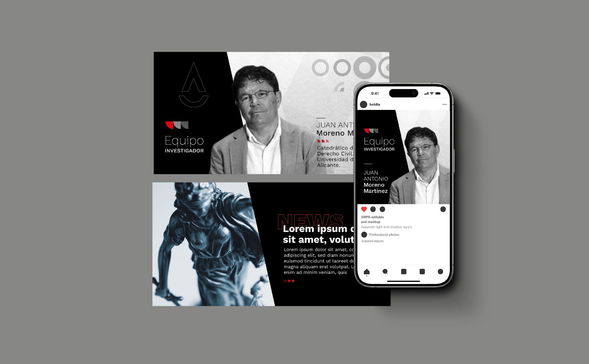
The development of IURIDIA’s visual and web identity was a carefully crafted process designed to mirror the project’s scholarly and rigorous nature, while simultaneously projecting a contemporary and approachable image. The foundation of IURIDIA was the creation of a name that would encapsulate the project’s core: the convergence of law and artificial intelligence. The strategic selection of “IURIDIA” stems from the Latin “iuridicus,” signifying “legal.” By abbreviating it and pairing it with the acronym “AI,” a succinct and modern term was coined that encapsulates the project’s focus.
This name is easy to remember and pronounce, evoking a sense of solidity and rigor, qualities inherent to the legal field. The combination of vowel and consonant sounds gives the name a pleasing and balanced rhythm, making it distinctive.
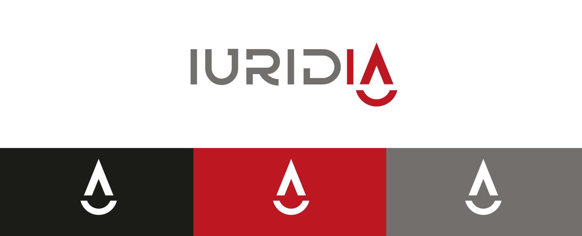
Based on the name, a visual identity was developed to reflect the project’s academic and rigorous nature. The carefully selected color palette plays a fundamental role in this construction. Burgundy, a color associated with passion, power, and elegance, was used to highlight the logo and give it an air of sophistication. Meanwhile, gray, a color associated with knowledge and neutrality, provides a touch of seriousness and balance.
The IURIDIA logo, due to its solid and compact construction, does not require alternative versions, as it is suitable for any space. Its design, based on simple geometric shapes and a clear typeface, conveys a sense of stability and confidence. The absence of superfluous elements allows the logo to be easily recognizable and adaptable to different formats and media.
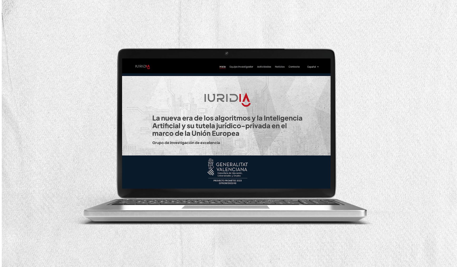
The design of the IURIDIA website is based on principles of minimalism and clarity. The geometric shapes and abstract graphic elements used create a sense of order and rigor, typical of the academic field. The arrangement of elements on the website facilitates navigation and allows the user to focus on the most relevant information. Additionally, special attention has been paid to SEO optimization to ensure that the website is easily indexed by search engines and reaches a wider audience.
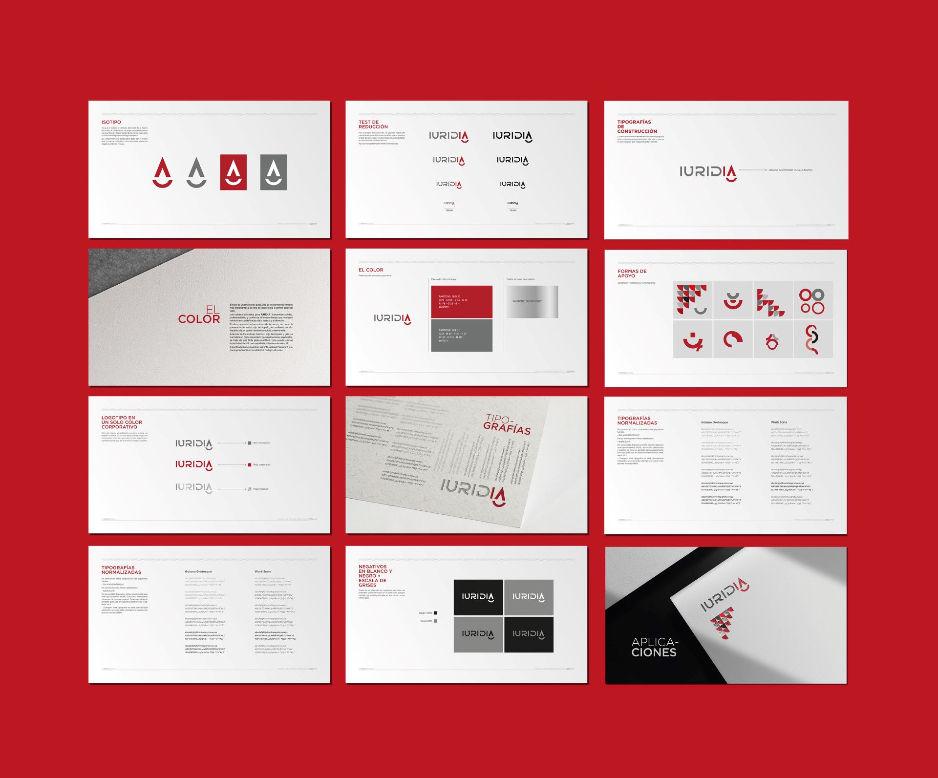
The IURIDIA visual identity manual defines the guidelines for the correct use of all the brand’s graphic elements, thus ensuring a coherent and professional corporate image in all communications. This manual establishes the rules for the use of the logo, color palette, typography, and graphic elements, guaranteeing that the brand communicates effectively and uniformly.
Once again, as is characteristic of Símbolo Ingenio Creativo, the visual and web identity of IURIDIA is the result of a strategic and rigorous design process. Each element, from the name to the color palette, has been carefully selected to reflect the essence of the project and convey the brand’s values.
This visual identity system provides IURIDIA with a unique and recognizable identity, positioning it as a benchmark in the field of legal research in artificial intelligence.


Do you need help?
¿Necesitas que te ayudemos?