Do you need help?
Do you need help?
Graphic Design
Branding
EOLAS is an online campus offering a wide variety of courses and programs designed to help you acquire new skills and knowledge from the comfort of your own home.
The project’s mission is to challenge the status quo and reinvent education, seeking to unleash the maximum potential of each individual, driving positive change in our communities and the world.
Their enthusiasm for education and knowledge was contagious. They spoke of their desire to create a brand that conveyed that passion in a fresh and modern way.
We embarked on a creative exploration, experimenting with various shapes and tones. We wanted a logo that was both simple and memorable, capturing the essence of the brand and etching itself into people’s minds.
The circular shape was an obvious choice. It represents unity, integrity, and perfection. But we didn’t want a perfect circle, something more organic was needed, evoking the complexity and dynamics of the human brain. Thus, the idea of an imperfect circular shape emerged, a kind of orbit suggesting movement and growth.
The color orange was another key element. It’s a warm and energizing color that conveys optimism and vitality. Moreover, it’s a very versatile color that can be combined with other tones to create different sensations.
And then there was the typography. We sought a bold and characterful font that would complement the circular shape of the logo and convey solidity and confidence.
By combining all these elements, the result was a logo that was not only visually appealing but also had a deep meaning. The circular shape, typography, and colors worked together to create an image that evoked creativity, innovation, and continuous learning.
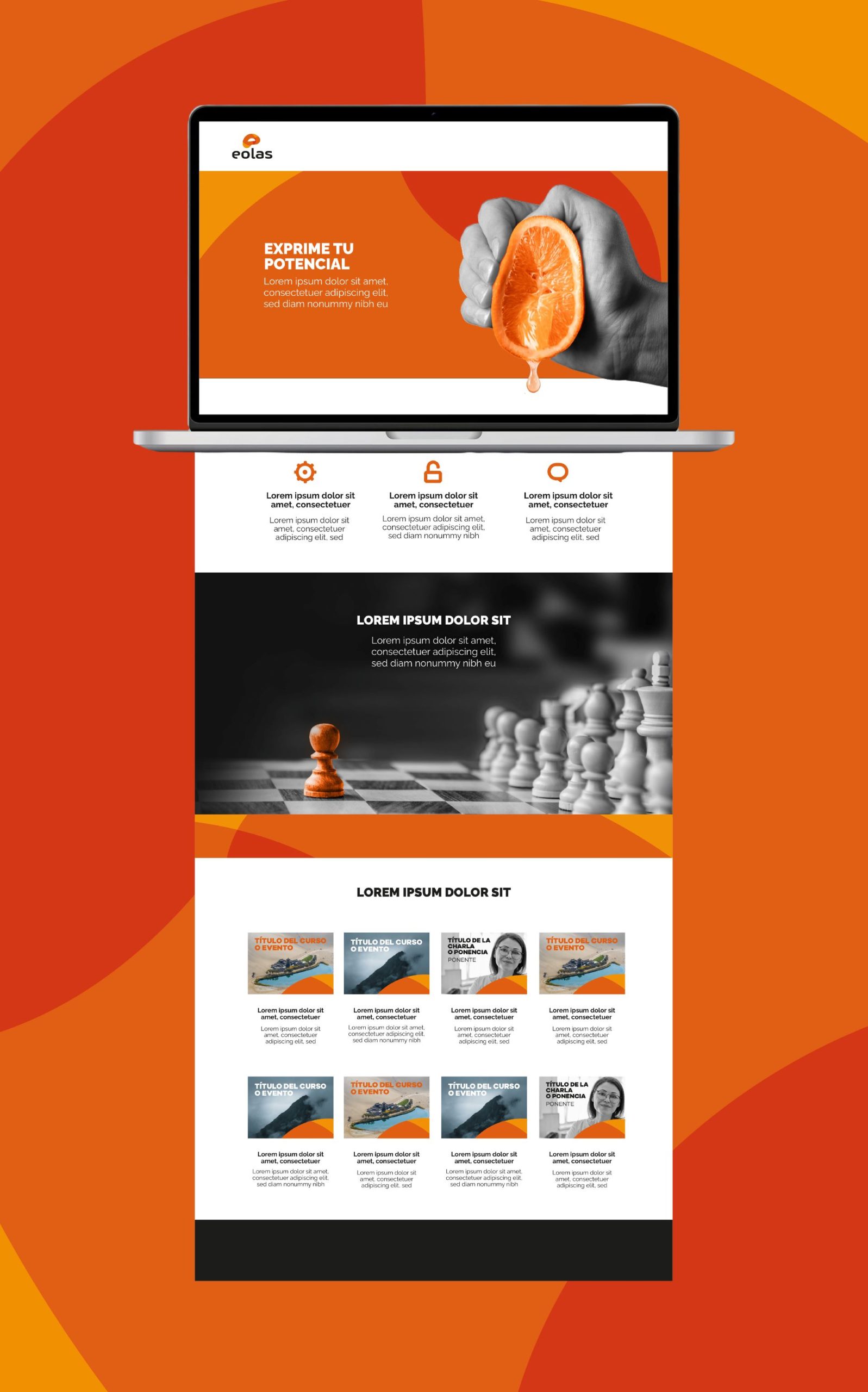
But our work didn’t end there. Once we had the logo, we developed a complete visual identity manual that included a color palette, typography, and graphic elements. This manual serves as a guide to ensure that the EOLAS brand is communicated consistently across all materials, from stationery to the website.
At the end of the project, when we saw the finished logo and how it integrated into all the brand materials, we felt a great sense of satisfaction.
We had created more than just a simple logo: we had shaped the visual identity of EOLAS, an identity that reflects the company’s values and mission.







Do you need help?
¿Necesitas que te ayudemos?