
Do you need help?
Do you need help?
Graphic Design
Branding
Website Design
Social Media
Communication
REPAREU is the acronym for the research project “The Right to Repair: Legal Incentives and Potential Barriers to Sustainable Consumption”, funded by the Spanish Ministry of Science, Innovation and Universities. Its aim is to contribute to the transformation of consumer law into a key tool for achieving the sustainability goals outlined in the European Union’s agenda.
At Simbolo IC, we supported the research team from the very beginning. Our challenge was to turn a legal and technical subject into a clear, professional, and impactful visual identity. We developed a meaningful name, a representative logo, a cohesive visual identity, and a website that transparently communicates the work of the research team. All of this was part of a comprehensive branding for research projects strategy.
Our first task was to create a name that distilled the essence of the project: the right to repair as a tool for sustainability and its European regulatory context. That’s how REPAREU was born. Its sound is direct and memorable, while also containing the project’s vision: to repair in order to transform, to think of Europe through the lens of consumers, innovation, and environmental justice. This conceptual foundation lies at the heart of every strong branding for research projects initiative.
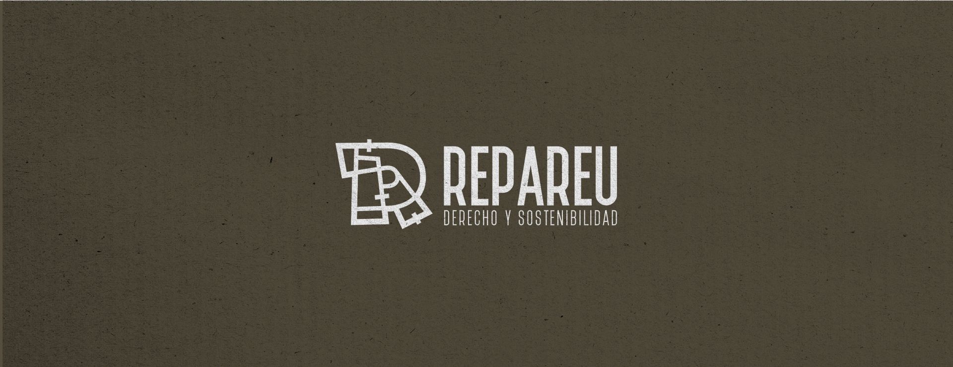
The REPAREU logo centers on a fragmented “R”—a graphic representation of the idea of repair. This segmented letter evokes fitted pieces and reconstructed structures, visually expressing the project’s spirit: to recover, reassemble, and transform.
The typographic composition is clean and solid, ideal for institutional and academic settings. Beneath the main title, the line “Law and Sustainability” highlights the two pillars of the project, using a sober and professional typeface.
The warm color palette—dominated by orange and ochre tones—conveys a sense of closeness, energy, and direct alignment with the project’s core values: transformation, action, and environmental commitment. REPAREU embraces an identity that radiates warmth, humanity, and ecological urgency.
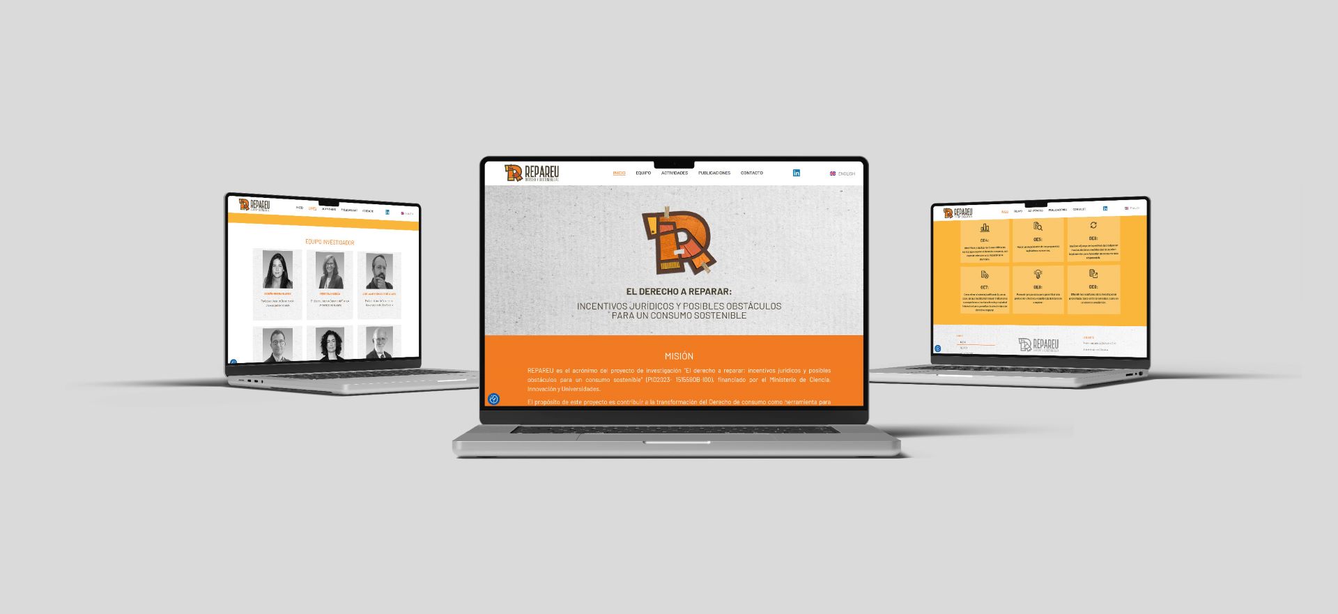
The REPAREU website was designed with a clear goal: to make information about the project—its goals, activities, and outcomes—easily accessible. The navigation structure is intuitive and allows users to explore each section with ease.
Special care was taken with content hierarchy and visual harmony to ensure a user-friendly experience free of clutter or confusion. Each section is crafted to reflect the legal, social, and environmental dimensions of the project, strengthening the branding for research projects strategy in the digital space.
Creating the brand and website for REPAREU was an exercise in translating complex legal concepts into clear, accessible visual communication. This project explores how the right to repair can contribute to sustainability and transform consumption patterns.
At Simbolo IC, we are proud to have created an identity that supports this purpose, reinforces it, and projects it coherently. We believe that design should serve the ideas that truly matter—and REPAREU is a perfect example of this.
Would you like your proposal to have a visual identity that matches its ambition? Write to us. We’d love to help you build a brand with purpose.




Do you need help?
¿Necesitas que te ayudemos?